Monday, 20 February 2012

Evaluation on second project

I had good prospects for the next project we were doing because we came up with the brief ourselves which was a challenge and made me feel more independent. I came up with my brief from one of the seminars we had a few weeks earlier. We were having a good discussion about defining Space and Objects. It really made me think further about this idea. There is nothing better than questioning many things because of the deep conversation you have had about a certain topic. I decided to make this idea of defining Space and Objects my title for the brief. The great thing about this topic is it is so open ended there are no limits and I could explore many different angles of the topic. It happened to link quiet well to my previous project which was called ‘crowded:uncrowded’. How are objects defined in crowded spaces and uncrowded spaces. I had a very positive beginning to this project and was excited to see how it developed.
I did 3D construction for my workshop, which is quite similar to Fashion. I have been continually working in 2D so it was good to push myself into 3D. It was quite hard making the transition, I had to spend a lot of time researching and getting my idea clearly set out before creating anything on the mannequin. It has also given me a better understanding of giving pieces structure and learning simple skills such as how to cut a pattern. I ended up using an unusual material because a lot of my inspiration came from pencil shaving. I decided to work with wood, which meant I used the laser cutter to etch my design. The negative about using wood is it is a very rigid material so does not have any flexibility meaning I did feel I slightly fell back into 2D but it worked with the whole concept of my project. In my next project, I will be sure to push myself in 3D as I naturally always go for 2D because it is easier for me.
In editing my ideas I am quite successful in that field, it is obvious to me if an idea I have come up with has no future in my project. However, I have a natural instinct to make sure everything is interlinking somehow. I often will not push myself in one direct because I know it has nothing to do with previous work I have done. However since being at Manchester I have re discovered that not everything has to link and you can have separate ideas just push yourself in the direction that you feel is most effective.
Overall I am very pleased with my final idea and have a lot more pride in this project then the last, which is I feel is down to organising myself  and coming to the studio more often. Furthermore, my project has a clear structure and flow to it and I have learnt new skills on the way that will be very helpful for future projects.


Sunday, 19 February 2012

Space and Objects

I felt that my project was not really distinguishing the difference between object and space as much as i wanted it too. So i started to think about one of the biggest objects and spaces..... land and sea. I started research images of sea and island and the contours around the islands.


this image the islands are linked by a road creating a connection between the objects in a space.


this is an image of an island with contours around it and makes me think back to my batik designs and the different shapes that were in them.


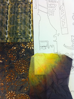
Julie suggest that my collar piece in keeping with the shaving idea that i should make it in wood and use the laser cutter to etch and cut my design out how i wanted it. I really like this image in my sketch book as shown above and felt it embodied different shapes in space and the confusion to what is batik and what is the photograph. So i decided to use this as my etching design and to have the shapes of my collar cut out of it.


Collar

I did not know what to make i knew what my inspiration for the garment was but not how to protray it and noticed that the designers I had been looking at all focused on the neck region. I also didnt want to do anything to complicated so decided to create a collar but not a usual standard collar something that was more of an artistic piece that was worn on the neck. I did a few sketches and came up with a simple design that reflected my brief looking at space and objects it even slightly incorporated my previous brief crowding:uncrowded.

Images of my designes can be seen in my sketch book. I am un able to paste them on my blog.

3D Workshop

It has been really interesting looking at a more structural version of textiles slightly edging on Fashion. However it has really made me think in more of a 3 dimensional way. How certain materials can be manipulated around the figure and you can add elements to completely change a piece. Julie showed use a group of amazing designer who really push the boundary of fashion it is more of an art piece on a figure because they are not piece you would wear out an about. One piece I looked at by the designer was Iris Van Herpen she created a piece that reminded me of the pencil sharpening from my previous project


the circular structure with a jagged rim and pleats which are similar to the lines on the shavings.

I then found another piece that reminded me even more of the pencil shavings by Sandra Backlund


Made from hanging up pegs that have been manipulated in a fan effect. After looking at these two pieces it really inspired me to link this pencil shavings element from my previous project into this one. 

Yayoi kusama

Yayoi kusama is an sculpture who really looks at the relationship between space and the objects she makes. She is continually trying to confuse the viewer by using the same print for both the space and the objects making it harder for the viewer to see what is what.In this example it is light and dark that makes it easy for the viewer to know what is what


She has a continual use of dots in her work which link back to Batik because 'ambatik' means 'a cloth with little dots' and she is using the dots to mask the space and object. It has been very helpful looking at her work because she creates sculptures that reflect what I am try to achieve. However I have mainly been working with print which is 2D but my new workshop is 3D construction which is more structural. I really need a push into work less 2 dimensional and more 3.

here is another example of her work using lighting it is so intriguing


New Brief

Space and objects how can we define them?
What defines space, objects and the relationship between them? What part does for example light, scale, pattern, line, surface play in defining space and form? How can they be manipulated to confuse the viewer?  I hope to achieve these ideas through different types of research looking at artist, architectures and photographers.  Though different aspects such as colour, scale, material, surface, pattern, shape and technique how where they able to confuse the viewer and will I be able to have the same success.

Bibliography:
Photography’s:
Clemens Kalisher
Magnum Photographers
Cassander Eeftinck Schattenkerk
Humphrey Spender
Painters:
Kyle Bean
Grayson Perry
Hundert Wasser
Fashion and Textiles:
Batik designers anonymous from a book a bought in Indonesia about different styles of Batik
Sandra Backlund
Una Burke
Iris Van Henderson
Anna Sofia Madson
Alba Prat
Amous Trangue
Sculptures/ Architectures:
Yayoi Kusama
Herzog and de meuron
Nettleton Tribe

Colour Day

We had to go out in Manchester and take 5 images off a list we had been given and then bring them back to the studio to hang up
I found it refreshing to have a break from our projects and look at other things and actually get out of the studio. Even though we all had the same brief, we came back with completely different images. It was also nice to place one of my samples in different surroundings and see how it worked. We were very lucky with the weather because the sun was perfect for the photosThe image i found most interesting was the double yellow lines, it is so simple yet you can take some many different photos of it.   

I loved looking at all the images on the wall and how the colours jumped out to me and made me look more closely at some of the smaller details. It looked like a mosaic wall of brights colours. No one knew who's images were who's so that made it even more interesting having anonymous images up.


here are some examples of the groups of images they are so different yet manage to complement on another

Sample Show

We had to bring in all our samples from both projects we have done so far, so from Origins and Samples. It was interesting combining my samples from different projects and creating intriguing colour palettes, structures, shapes, use of marks and mixture of 3D and 2D. It was also a way to look at how my peers work and how they combined their own samples in different catalogues.
Katie then chose particular people to show their sample and got out peers to choose combinations unaware of what their project entailed. Then did the same thing but with people who knew their project brief. It is interesting to see the difference of know their brief or just picking out elements of samples that you feel work together. I found this session very effect and have started to use it in my own work, by getting people in my flat that are unaware of my project and see what they think my samples reflect, this can even lead you going off in a different direction. I feel it is so key to observe my peers development and their influences and to get feedback from them in our tutorial session because they often have key points that I have not even though about.

Here are some combinations of my samples:


Some where more successful then others it was just interesting to look at combinations i would have never though about

Thursday, 9 February 2012

Pencil Shavings

I wanted to move my project on to a completely different direction when I started doing my workshop in 3D construction. So I started to look at other forms of crowding and uncrowding which could be developed into a structured form.


My idea was completely by accident, I had left some pencil shaving on one of my pieces of paper and though it would be an interesting area to develop. There where elements of the pencil shavings which reminded me of the Batik design so I was still linking it back to my last project. Also I was focusing on a different element of Crowding:Uncrowding. I was looking at space and objects and determining the differencs between them. Which i had set as part of my new brief.


I discovered an artist who used shaving to re-create portraits of people and found it fascinating called Kyle Bean.


I tried to form my own Batik designs from these shavings and felt they were very successful and used elements fo my old colour palette.


Colour

A big focus of this project has been the colour for me, i felt in my last project my colour palette was very bland and boring. I wanted to use a lot more colour similarly to Hunder Wasser.

I found the session we did on creating a colour paletter from an image very useful and a technique I will be using in other projects.


Then I looked at getting a colour palette from Hundert Wasser and did this on Photoshop by getting the exact colours he was using in his work, trying to be as precise as possible.


I used this colour palette in my printing I simplified the orginal colour palette to a few of the colours I really thought would work with my print. I went from screen-printing to painting straight onto the screen and creating a hand crafted printed design, using the colours which I had selected. It has a sense of freedom to it. It also reflected my title crowding and uncrowded and was also bawsed on a Batik print combinde with a photography. I wanted to develop this further but it was the end of my printing workshop, which was annoying, but hopefully I can revisit this skill as I really enjoyed it.


It is a prefect combination of a crowded area in an isolated place which is what I was hoping to achieve in my project.

Batik and Photography

I wanted to link my orginial idea of Batik design to combining it Photography, as shown below.


There are so many different elements of these two-piece that complement one another. I experimented with Photoshop by combing them together.


The combination of the rich gold and blue against the black and white setting. How the shapes of the Batik complement the railway track and making it look very different. Even the no parking sign really sets the scene. I think this combination of piece could not be better suited.

I did this with other style of Batik and different Photography's of crowded areas and came up with this design for my screen print. I then brought the different elements together to give it a more crowded feel.


Ending up with this as my screen print design which has a real Hunder Wasser feel to it. Here I have put a piece of his work beside my design to look similar aspects. 


Linking my projects with Photography


This mind map is focusing on the different aspects of Crowded:unpopulated. How I can reflect it through my print workshop from looking at the presentation, repetitive patterns, patchwork style, contrast small areas with larger areas. Another key factor that I really wanted to look at was Photography. I looked at old black and white photos of isolated areas ( desolate street) and crowded area ( busy train station) looking at photographers such as Clemens Kalischer, Humphrey Spender and different scene in New York.

EXAMPLE OF HUMPHREY SPENDER:

Isolated in a crowded area: A women among looms


Crowded area in a classic isolated place: Massive crowds on the beach


There was also a link I maked with my last project looking at Rashid Rana who created huge images from using tiny Photography's and the images of the small photos contrasted with the topic of the whole piece.

What I feel about the project so far

Since starting this project, it was all about new beginnings for me as I felt I did not really prove myself in my last project. However it did really help that the focus of this project was sampling aka experimentation which is my favourite element of the how process of a project. From just making a small mistake or developing a certain experiment in a certain way, you can end up with your project leading in a completely different direction.