Saturday, 31 August 2013
MANCHESTER DEGREE SHOW
As I was unable to attend the degree show I researched some of the students work through their website
Friday, 30 August 2013
Lee Wallwork


Lee Wallwork:
Is a Graphic Designer whos work is very consumper based. He looks at many different area such as Art direction, photography, branding....
His style is very crisp, clear and slick using different forms of technology.
His work that I particularly like is The Ted Baker Designs. He has experimenting with looking particularly at India but keeping the brand by infusing the classic design with an Indian twist through the uses of bright colours, spices and paisley designs. He has gone with one idea and stuck with it particularly creating the paper tuxedos making them sharp and sleek linking back to Ted Bakers British Brand.
His presentation is key and so clearly shown through colour, design and typography. He is clearly technology driven and good at using the tools.
From looking at his work it has woken elements in my own work that I can improve on and develop in.
Rebecca Swarbrick


Rebecca Swarbrick is a Graphic Designer who has mainly looked at producing her own Zines but looking at it through the digital world.
Her work that stood out to me was the project WATCH as it focused on the social media site Facebook.
Making a publication looking at the bitchy side of Facebook set out in a similar format. Looking at the layout of Facebook and how you can make it into a publication by using the symbols and colouring of Facebook (the brand).How she has put it in a Zine format having a hard copy as it is more of a blog idea (writing your thoughts out online for the whole world to see). Well presented and clearly layout Zine also broken up with the PUNCH (digital fist) in the middle like a wake up call.
I really like how she has looked at something so current and that everyone uses. Makes you think who is watching you. From looking at her work it has made me think about topics for my final project and how I could link it to the technology era and how it has impacted our society.
Lucie Crewdson

http://www.luciecrewdson.com/
Creating photographs that portray strange and surreal in beauty looking at the female figure.
Fashion Photography with the likes of FAKE magazine, DAZE Digital. However even standing alone they are pieces of art in themselves something I would have in my room. The variety from the colours she uses in her photographs the imperfection through over exposure add a romantic quality to her work is really hypnotic. Giving each image a vintage feel.
From looking at her work the organic qualities shown in her outcomes have made me think about considering these elements in my own photographs.
Saturday, 23 February 2013
Evaluation
I have really enjoyed this project because it has allowed us to interact with the outside world and get more of an idea of what briefs are like. It has allowed us to locate our work in an external context. There were a number of briefs for us to choose from that the course provided however, none of them were very Art Direction based. I decided that I would find a brief myself. I used information from a previous lecture and researched on different websites to find a brief that suited me. I researched on my own and found a project that fitted exactly what I wanted my brief to be and I touched on it in my last project. It is about try to look at having more diversity in the fashion industry when it comes to models: with size, gender, age and race. It is sponsored by the company 'All walks on the catwalk' and i-D. A company and magazine, which I really look up to and love the things they do. This project also had a deadline, which was the 15th of February, which meant I had to make my own time management and stick to it, as after this deadline you cannot submit any work. This added a bit more pressure which I felt was good for me. I made a clear timetable of when I had to have certain part done by because I wanted to two of the brief in the same competition one, which was photography, and the other, which was a zine.
I also wanted to show in both my projects my skills that have developed in Photoshop, InDesign and Illustrator. I used mainly InDesign and Photoshop with the making of my zine. However, I used Photoshop and Illustrator for the making of my four photographic images. The fact that the brief is quite short and not very detailed means there are many things you can do, however it also means that you need to make sure you are still fulfilling the brief. I was very conscious of this and made sure that my projects developed by still staying true to the brief. I had to critically analyse my own work and realise what did work and what did not. I had to make these decisions fast as I had the issue of time and wanting everything to be of a high standard not just doing something in the end because it was all I could do in that time.
One of the key elements to the project was the fact that it had an outside context and our tutors wanted us to make contact in the outside world. Will do this project I was also look for internships during this summer, I applied for one of the jobs at Conde Nast because did not get it. I knew it was very competitive but I thought I might as well try. I know from doing this project though that I would like to get an internship in a magazine or be a photographer’s assistant. I have not developed my contacts in the outside world as much as I should have. However, I have made many copies of my zine; I want to try to see if I can sell them to shops in the northern quarter or even cafes. I would like to develop my zine into have more issues, I have already started to plan the next one. I am also going to continue looking for internship that I feel I would really benefit from, from the month of May. I am also going to try to visit some Art direction companies while on our New York trip and see if I could maybe even get some experience there.
This whole project has been a real learning curve, I have thought about possible areas I would to go into. Realising that having technical skills in Photoshop, InDesign and Illustrator is key to making it in the industry now. That you really need to get your brand/ self out there as much as you can via social media or going around and trying to present people with you brand and why it would be right for them. The focus of this project was the context, which is good because that is what it is like in the outside world. I very pleased with both of my project outcomes and would like to think that they will be considered to win the competition but this is the downfall to competitions you have no idea of how many people you are up against or their skills, which makes it even more daunting.
Consumer
The consumer for both the briefs are very similar as they are in the same competition and have the same ideas behind them;
They are predominately women of all ages ranging from 16-70. They are people who read i-D magazine, have heard about All Walks of the Catwalk, they are people who love designers like Vivienne Westwood, Mark Fast and Alexander McQueen. Photographers like Nick Knight and Chen Man.
Love fashion and have quirky style but are bored of seeing the same carbon copy of models in campaigns and walking down the run way. They want to see 'real' women have a higher impact in the fashion industry. It is for the young girls who are just getting a taste for fashion and want to be a model, glamorous etc. But has not 'real' figure to look up to just stick thin figure that are predominately unhealthy, this is often how young girls start to become really insecure in themselves and this can usually cause an eating disorder because they are comparing themselves to unrealistic ideals that are in magazines, that have been photo shopped and airbrushed to look like the ideal women, that no one naturally looks like.
I have placed my four photographs in the context of London fashion week as Campaign poster. However if I was to win this competition my work could be exhibited in Graduate fashion week.


I overlayed some of my own images in the brochure for the exhibition at the national portrait gallery All Walks did, called SNAPPED. It was an exhibition promoting diversity with different age, shape and race models wearing samples of British designers clothes. This photographs are powerful, striking and really show of the clothes.
In the words of Fred Astaire ,'Every girl on every page of Quality has grace, elegance and bizazz now what is wrong with bring out a girl who has character, spirit and intellect '
My zine has a very similar consumer however they are interesting in also seeing the layout of a zine combined with the context of a magazine such as including an interview.
It is a small inspirational little zine which will boost a woman's confidence for her to see a 'real' women who she may even see on the street and not think twice about but when she is put in front of a camera turn in to a model. A women who has is fun, has character, intellect and has quirky style. Each issue will be aimed at a different age group audience or like i-D include a combination of different topics some more relevant to a young age group and some to an older.

Tuesday, 19 February 2013
Final Zine
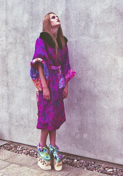
My final zine could only have the maxium of eight pages following the brief that was set for me. The content consists of a combination of photography, quote and an interview. The photographs are taken from the shoot I did with Dot. There is one quote from Alexander McQueen and the others are from the film Funny Face and also stills from the dance scene , the interview which I wrote myself is based on topic that All Walks explore. The photos below show the final zine. The front cover was even influenced by the iconic close up image of Audrey Hepburn's face in black and white in Funny Face.
I got inducted into a book binding workshop so I could make the final zine myself. I made it with a combination of stitch and glue and with cartridge paper.


Subscribe to:
Posts (Atom)